Typography Article
Typography is probably one of the last things people think about when making a website but it could be one of the most important things in how it portrays a business. Knowing your audience when selecting a font type, font size, ect is just as important as the color scheme and content. For example, a lot of people like the font comic sans. While there are sites where it could work, like a comic book store or comedy show, using it for a hospital or law firm probably wouldn’t give a person confidence to use them for help.
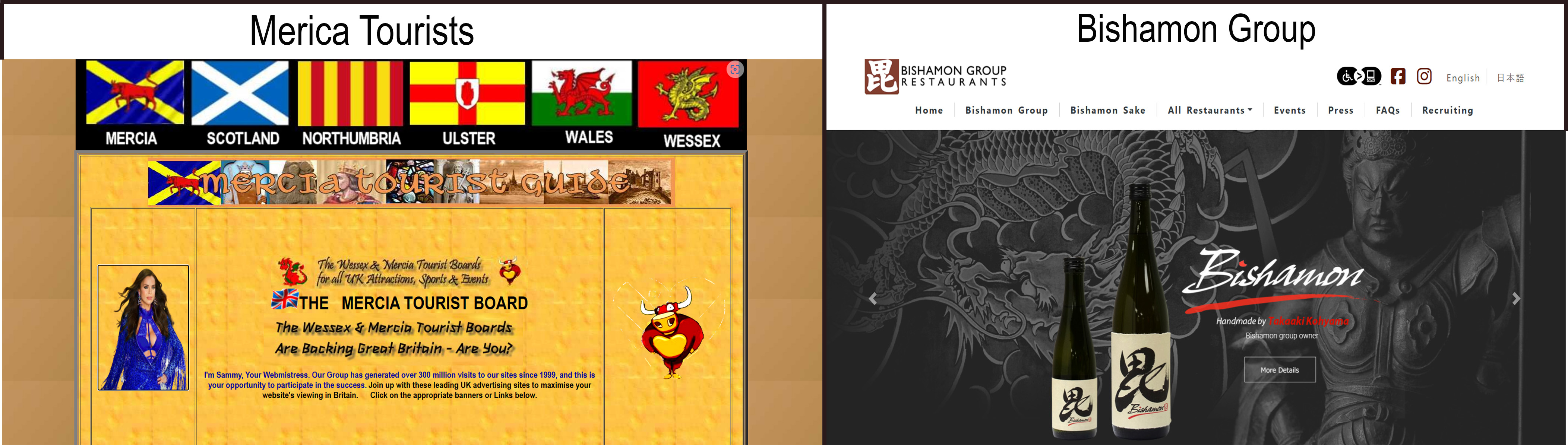
An example of a website that has numerous typography problems is Merica Tourists I’m going to point out a few problems I noticed. First and foremost the font size is too small for the page making it difficult for people to read. I think the person used a small size to try to fit all information on the page but it would’ve been better to increase the font size and move most of the information to other pages. Another problem is all the font types. There appears to be at least four different fonts at just the top of the page. This makes the page look disjointed and hard to read. The last thing I’d like to point out is the text shadow on the text.
“Wessex & Mercia Tourist Boards for all UK Attractions, Sports & Events”
Between the small text size and the shadow it makes it very hard to read
An example of good typography is Bishamon Group. This webpage has a very traditional look to it. I enjoy the typeface that Bishamon used for their name because it's very reminiscent of an old Japanese writing tool, yatate, which ties into the company's culture. I feel the web page is easy to navigate and easy for most people to read. This means most people will take their time to read it carefully and know the information.