Typography Overview
What is Typography?
It is the style and appearance of the text. Its a process of giving your text a visual look or appearance. Typography is used as a tool by graphic designers. All to create an end product that is understood and pops out to the naked eye. Also it involves selecting typefaces, point sizes, line lengths, line spacing, letter spacing, and adjusting the space between pairs of letters.
Font
A specific set of distinct, stylized letters within a typeface. For example, Garamond Regular, bold, 12px and Arial, italic, 6px.
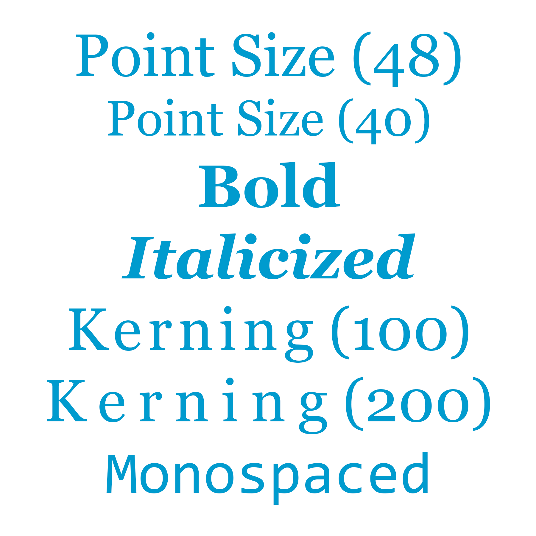
Point Size
The size of the space a character takes up (the character itself, as well as the space the character needs around it). Most printed books use 10–12 point-size text.
Serif
A serif is a small hook-like element, which resembles a foot, found on the end of lines in some typefaces.
X-Height
The height of a lowercase x in a typeface. It captures how tall a standard, lowercase letter within a typeface will be. Is used to describe the proportions of a given typeface.
Text Shadow
A visual effect added to text to make it appear 3D. A text-shadow can range in color, position relative to the text, blur radius (the distance the shadow blurs outward), and opacity (the transparency of the shadow).
Bold
A font style that is thicker, and thus visually darker, than regular text. It is used to draw users’ attention to specific words or phrases.
Character
A single symbol or glyph in a font.
Kerning
The negative horizontal space between consecutive characters, often applied to a specific group of letters. Sometimes, kerning is referred to as the “breathing room” between letters.
Italic
A font style that slants characters to the right. It is used to draw users’ attention to specific words or indicate proper nouns.
Monospaced
A typeface where each character is the same width (for example, Courier New). Monospaced typefaces are used when uniform spacing is useful, like programming and tables.